A HeroBanner is a dynamic top image that combines image and text in several different ways.
When using the graphic elements in a top image, you need to make a trade-off between form and content. Does the graphic element add to the user experience, or it just for decorative purposes? While it’s perfectly fine to make your page welcoming, users will typically visit it to find specific content.
A few words on patterns and squares
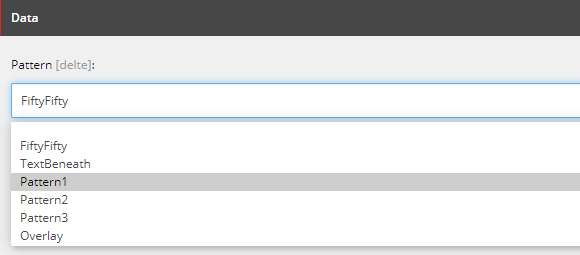
The banner’s so-called Pattern field allows you to control and combine different ways of displaying your content in the banner: FiftyFifty, TextBeneath or Pattern1, 2 and 3.
Note that Pattern1, 2 and 3 are based on a perspective grid made up of squares. The size and location of the squares change according to both the selected pattern (1, 2 or 3) and the contents of the fields (title, teaser, hashtag etc.).
Below you will find a few examples using the different patterns.
The image size is shown in each example. For all banners, to create a calm expression, the same image and the same pink colour theme have been selected in the Theme field, but feel free to choose between all of SDU’s colours, which include eight colours in addition to black and white. You can also insert a different image.